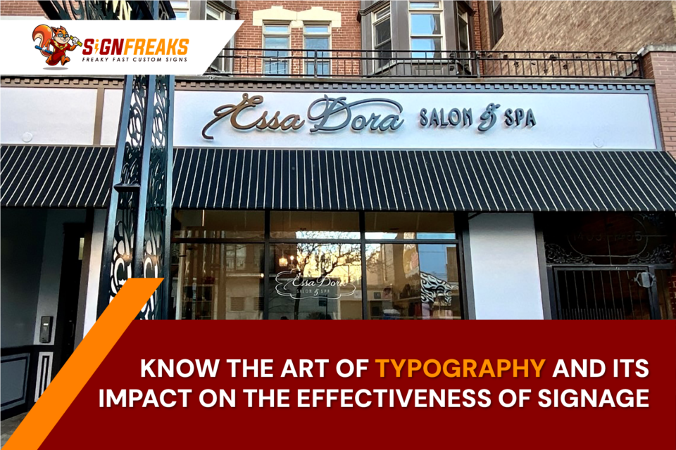
In the bustling business districts and colorful streets of cities like Chicago, signage is not just about marking a business location; it’s an essential communication tool that speaks volumes about your brand. The effectiveness of this communication largely hinges on the art of typography, a crucial yet often underestimated element in sign design. Understanding typography and its impact on signage can transform a simple Sign into a powerful brand ambassador.
The Power of Typography in Signage
Why Typography Matters
Typography involves the style and appearance of printed matter; in signage, it influences how text is perceived from afar. The right choice of type can catch the eye, convey brand personality, and enhance readability. It’s not just about the words you use but how those words are presented. Whether it’s the elegant serifs speaking for a boutique hotel or the bold sans-serifs shouting out a tech startup’s location, typography shapes how a message is received and whether it stands out in a competitive visual landscape.
Enhancing Readability and Visibility
Effective signage must be legible and visible from a distance. This requires careful consideration of font size, typeface style, and letter spacing. High contrast between the text and the background improves visibility, as does the size of the letters, which should be scaled based on how far away viewers will be. Additionally, the choice of typeface plays a significant role; some fonts are inherently easier to read from a distance than others. Sans-serif fonts, for instance, often make the best choices for clarity and readability in fast-paced urban environments.
Emotional Impact and Brand Identity
Conveying Brand Personality Through Type
Typography can evoke emotions and set the tone for your brand. Each typeface carries its personality – be it professional, friendly, or luxurious. By selecting a typeface that aligns with the values and vibe of your brand, you ensure that your signage resonates with the target audience on a deeper level. This emotional connection can make your brand more memorable and increase customer loyalty.
Consistency Across All Branding
Maintaining typographic consistency across all your brand’s touchpoints – from signage to digital presence creates a cohesive brand identity. This consistency helps in building brand recognition and trust among your customers. It reinforces that the brand is well-managed and detail-oriented, qualities that are often crucial in consumer decision-making processes.
Understanding Typography and Consumer Psychology
Typography isn’t just an art; it’s a science that plays into consumer psychology. The way information is presented affects how it is processed and retained. For example, certain fonts can enhance the speed and accuracy of reading, which is particularly important in signage, where messages need to be understood quickly by passersby. Additionally, the right typography can increase the overall attractiveness of the sign, drawing more viewers and potential customers.
Practical Applications in Signage
Typography in Different Types of Signs
Different types of signs require different typographic approaches. For instance, informational signs like wayfinding or directory signs benefit from simple, highly legible fonts that facilitate quick comprehension. Promotional signs, on the other hand, might use more distinctive fonts to attract attention and express creativity. Understanding the function of each sign and the typical viewing distance can guide the typographic choices to optimize the sign’s effectiveness.
Typography Trends and Innovations
Keeping Up with Typographic Trends
In the world of signage, staying abreast of current typography trends can keep your brand relevant and appealing. This involves exploring innovative fonts and design layouts that may become prominent in consumer preferences. For instance, minimalist fonts have seen a surge in popularity across digital and print mediums due to their clean and modern appearance. Applying these trends to signage can attract a contemporary audience and give your business a fresh, up-to-date look.
Innovative Uses of Typography in Signage
Beyond traditional uses, typography in signage can be experimental and creative. Techniques such as mixed typography, where different fonts are used within the same sign, can create a dynamic visual appeal that captures attention more effectively than uniform text. Layering text with graphics or using 3D typography can also add depth to your signage, making it more memorable and engaging. These innovative approaches can help differentiate your brand in a crowded marketplace, showcasing your company’s creativity and forward-thinking attitude.
The Technical Side of Typography
Font Selection and Licensing
Choosing the right font is just the beginning. It’s essential to ensure that the fonts used in your signage are not only effective but also legally compliant. Font licensing can be a complex area, especially for fonts that are not open source or freely available. Navigating this requires careful attention to detail and an understanding of copyright laws to avoid costly legal challenges.
Working with a professional sign company ensures that all typography used in your signage adheres to legal standards, preventing potential intellectual property issues down the line. These experts manage licensing requirements, ensuring that the fonts enhance your signage ethically and legally, aligning with your brand’s integrity and values.
Impact of Typography on Sign Longevity
The durability of your sign’s typography is as important as its initial impact. Factors like the type of paint or digital print methods used can affect how well the text withstands weather conditions and sun exposure. Quality sign companies employ high-grade materials and advanced printing technologies that maintain the clarity and vibrancy of your typography over time, ensuring that your sign remains effective and attractive for as long as possible.
Final Thoughts
Mastering the art of typography in signage is key to making your brand stand out and speak effectively to your audience. Whether it’s through enhancing readability, conveying brand identity, or leveraging consumer psychology, typography plays a pivotal role in the success of your signage. When you are ready to elevate your signage with expert typographic design, consider partnering with SignFreaks. Known as a leading Sign Company in Chicago, SignFreaks excels at crafting custom signs that brilliantly reflect your brand’s spirit through strategic typographic choices, ensuring your signage is not just seen but remembered.


